WZMN is a project designed by WE Architects. Sometimes it’s love at first sight. In this case, they were a cute couple who had just purchased a typical 70’s style apartment, which had old and neglected vibes. It was located in central Tel-Aviv, near the Ichilov hospital. photography by ITAY BENIT.
.


As an architect, one must be both highly creative and very analytical, in order to create a final result that embed both aesthetic and practical qualities.
It was a perfect match for all of us, since this couple was the perfect example of such a combination – the husband has a very creative and unorthodox skill set, while the wife is a prominent entrepreneur in the intelligence-tech industry (with a very good taste in shoes, if I might add).
The type that you will one day find in a Forbes magazine’s 40 under 40 article.
Equipped with an adequate budget and a detailed vision, we set off to discover the property’s hidden potential.
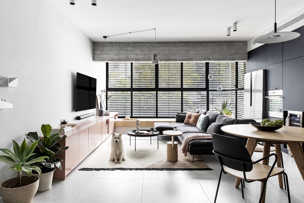
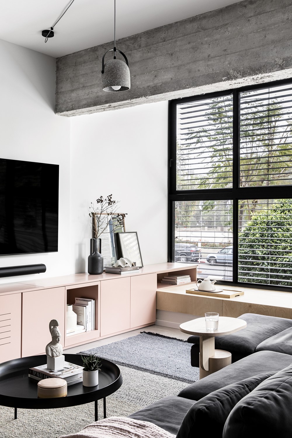
Since they both come from warm-hearted families, in which hospitality is key, we wanted to challenge the conventional seating arrangement options.
Our approach was to find an elegant way to both accommodate a large number of people while entertaining, but without sacrificing a large portion of the living and storage spaces.
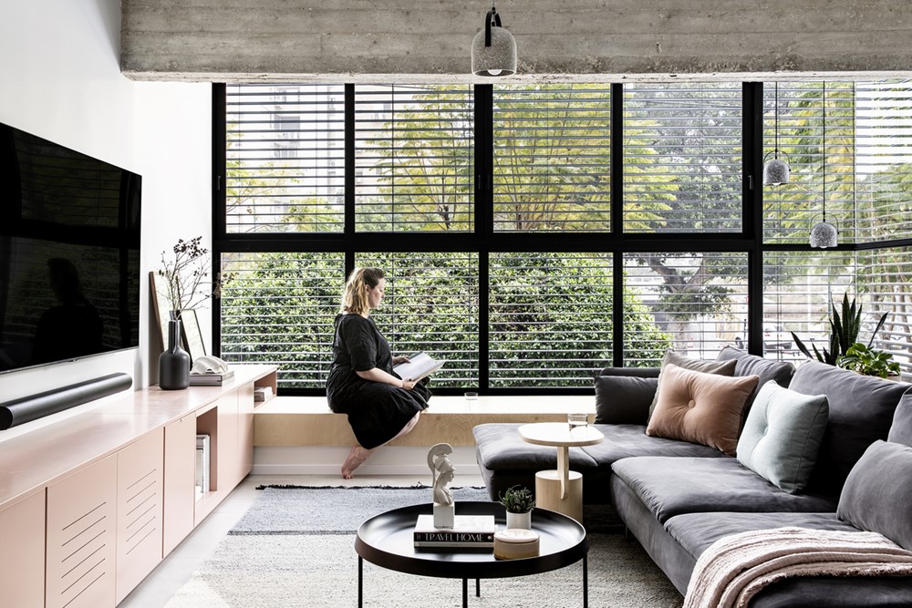
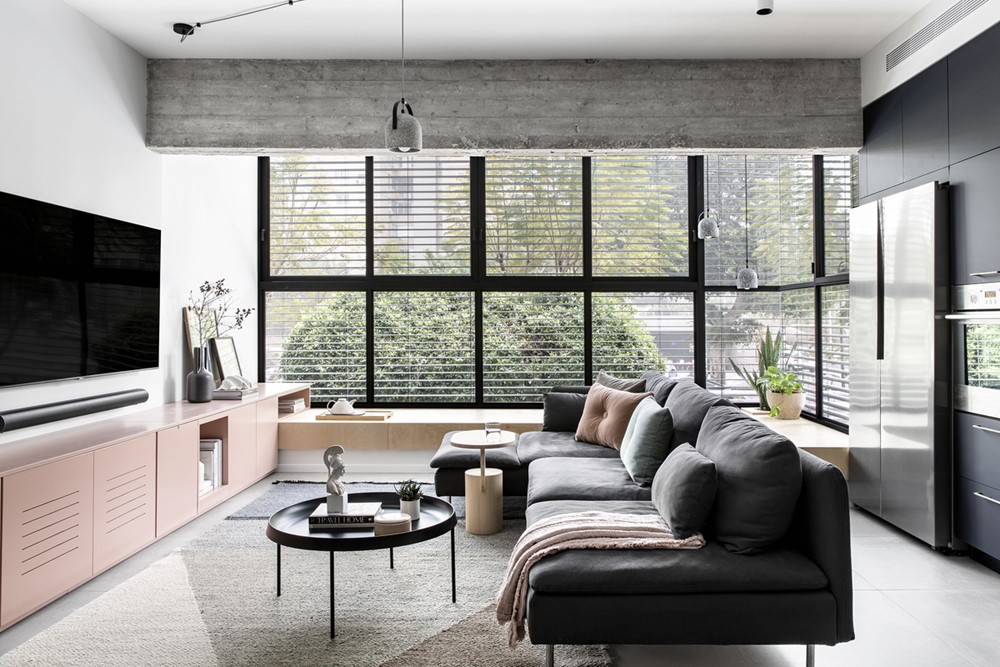
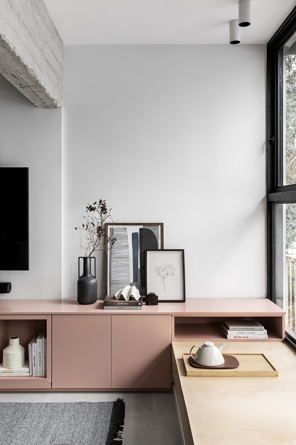
This led us to design a solution which consists of a birch bench, which allows both chilling in front of the TV and hosting a large number of guests comfortably.
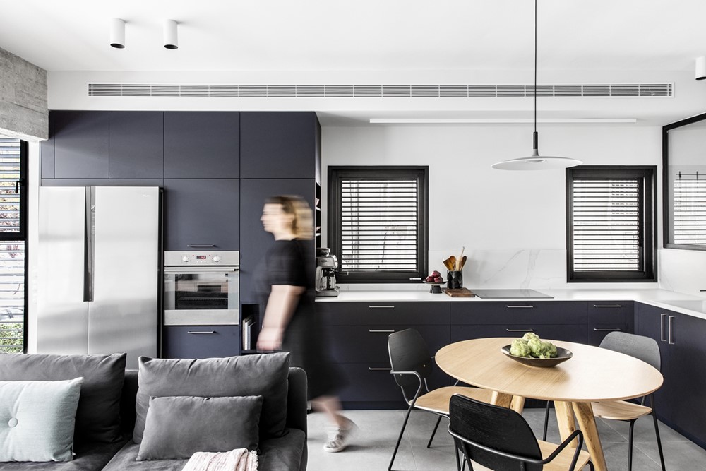
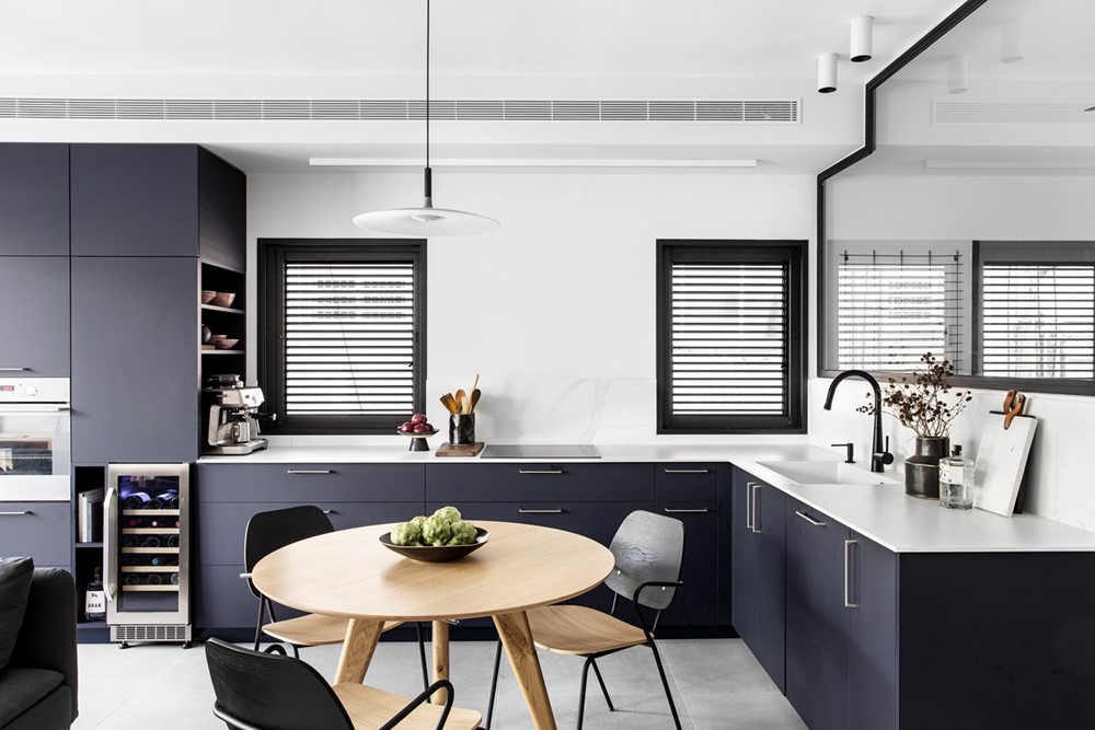
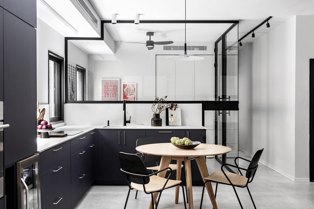
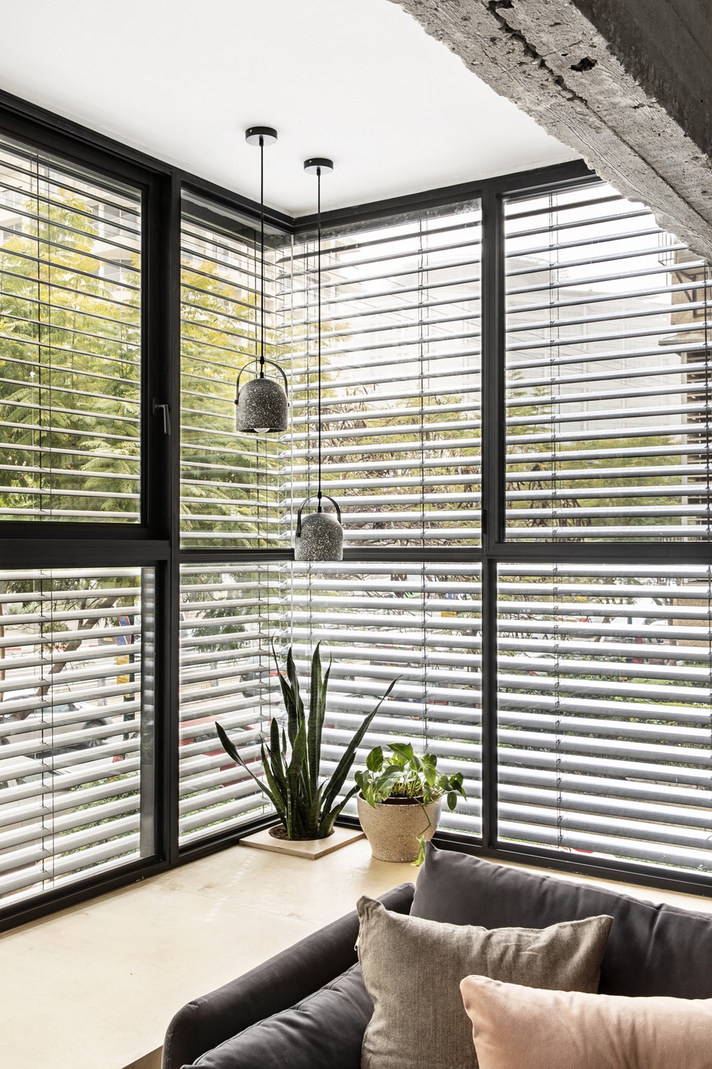
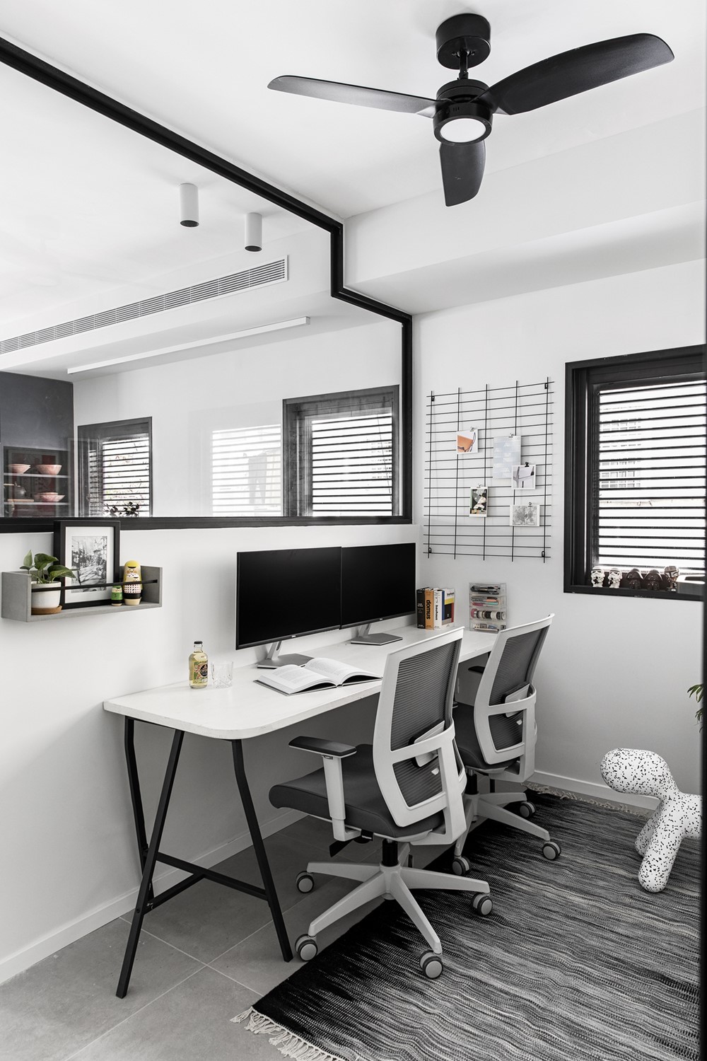
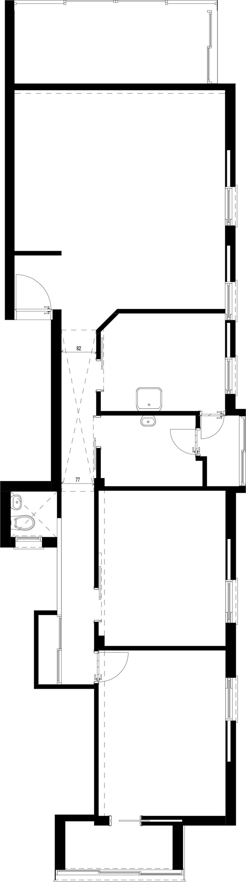
The communal space is effectively comprised of the kitchen and the living room, but visually the study room is also an integral part of it, since its it has glass walls. This enables the communal space to enjoy a flow of natural light from multiple directions thus creating a more spacious feel.
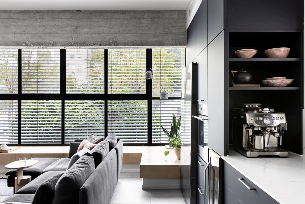
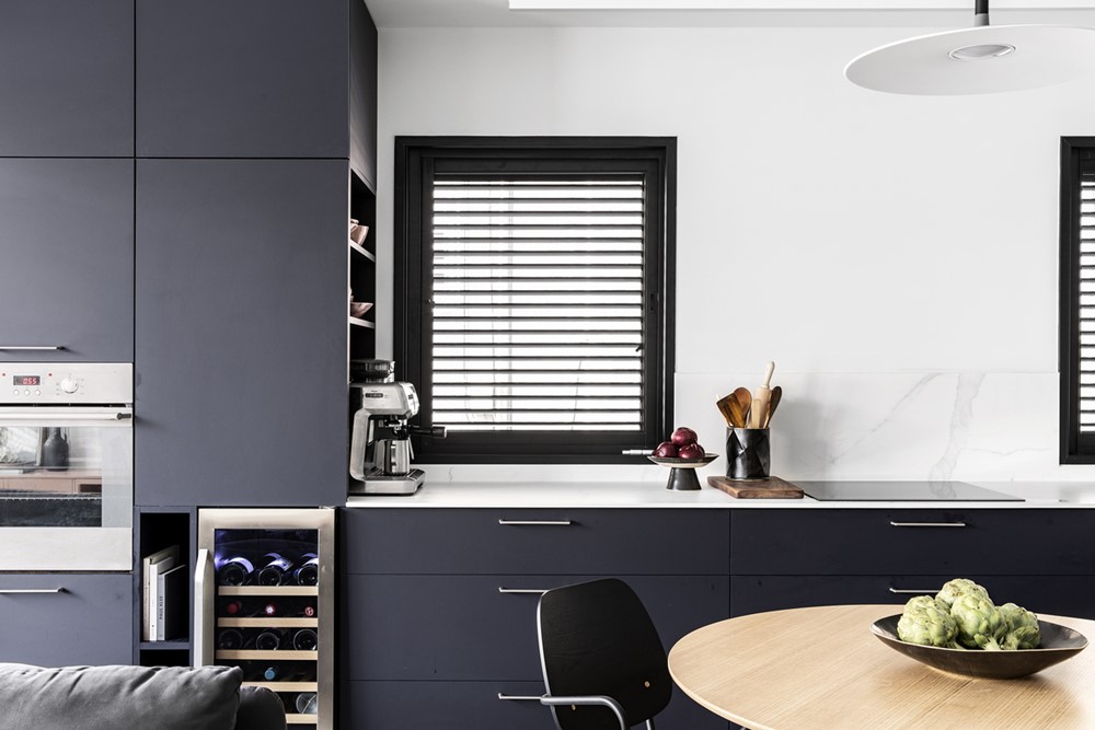
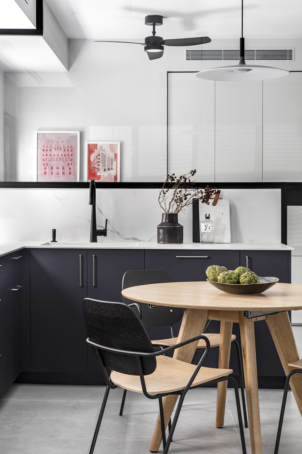
The kitchen is minimalistic in its design and color. Its “L” shape is wrapped around the extendable round wooden dining table, which gives it a cozier vibe.
The kitchen’s design also incorporated open storage units dedicated specifically for frequently used appliances.
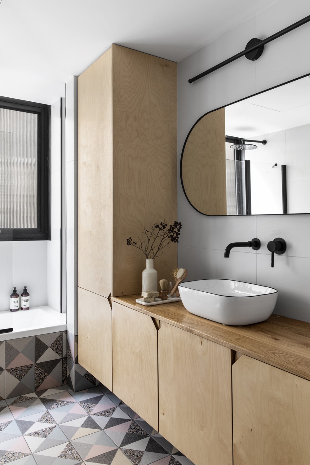
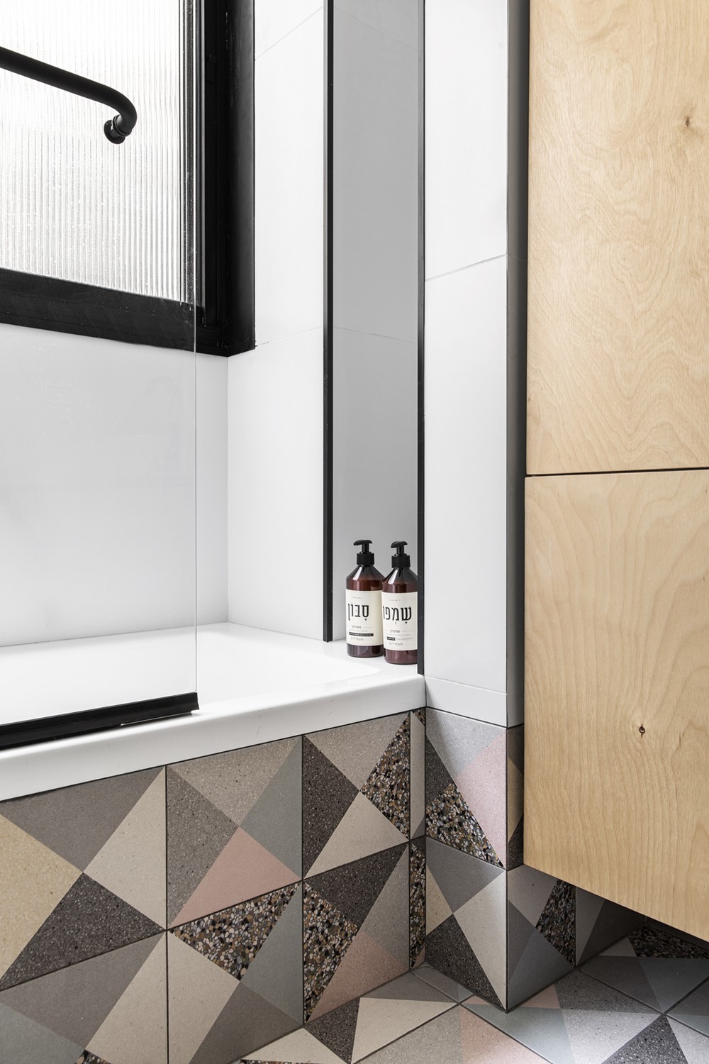
The main bathroom feels very spacious and lit. We chose a design which integrates both minimalistic white tiles and a more unique geometric terrazzo tiles. The carpentry is made of birch and has unique triangular CNC handles.
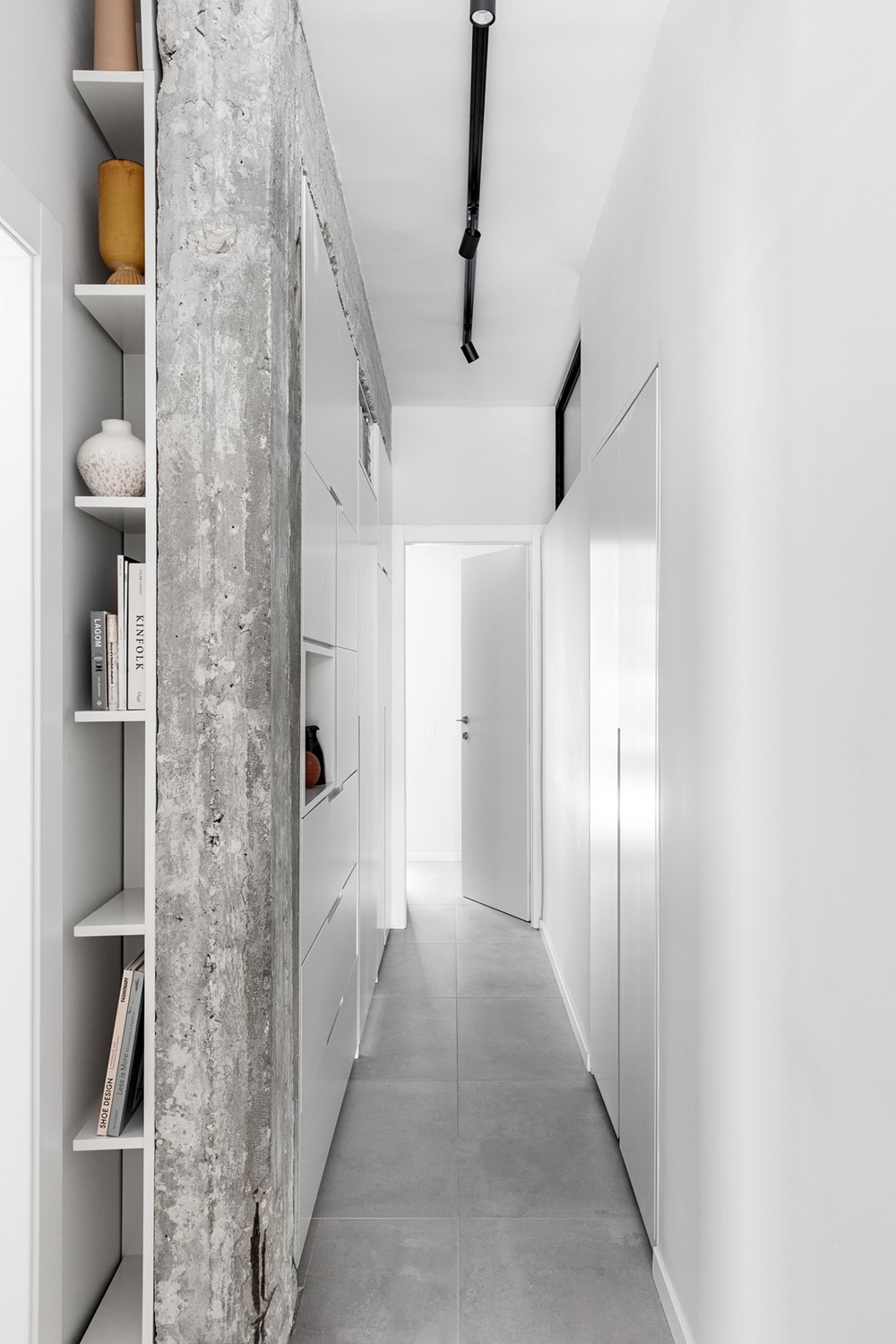
At first sight, the corridor seems mundane, but it camouflages an elongated storage unit, which also holds a secret entry to the nursery. This was done in order to reduce visual clutter, since this corridor also inhabits 3 other “regular” doors, and a “rough” looking exposed concrete beam and column.
Another unique feature the corridor provides the house is atmospheric lighting – this was done with an upper window, which is facing an internal shaft of the building, this is why we have mounted special lighting fixtures in the shaft, which projects light onto the window.
Thanks to the masterline glass texture of the window, the light diffraction is very subtle and cozy.
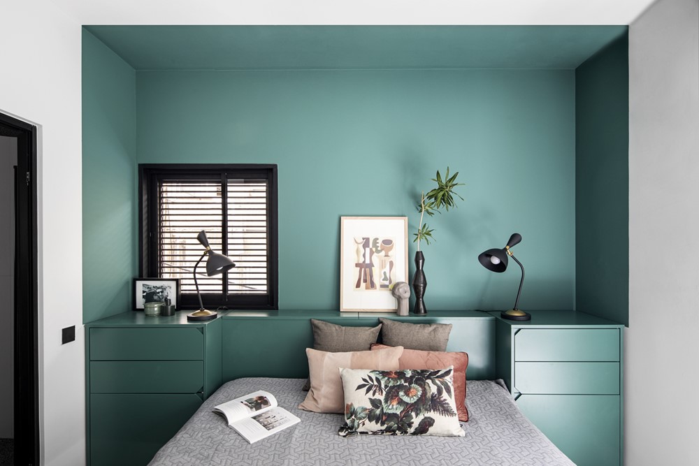
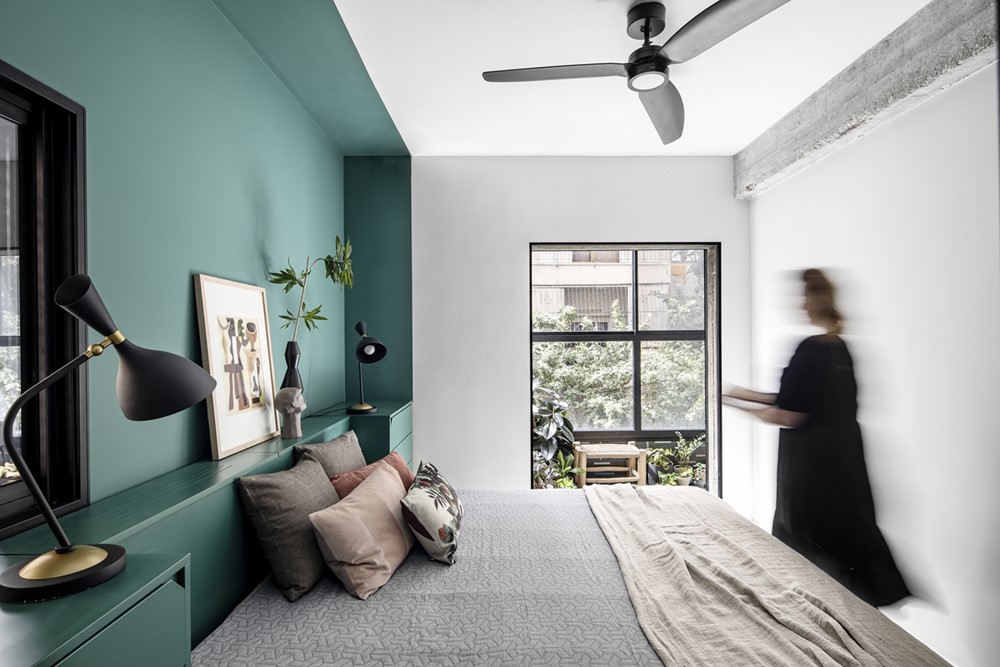
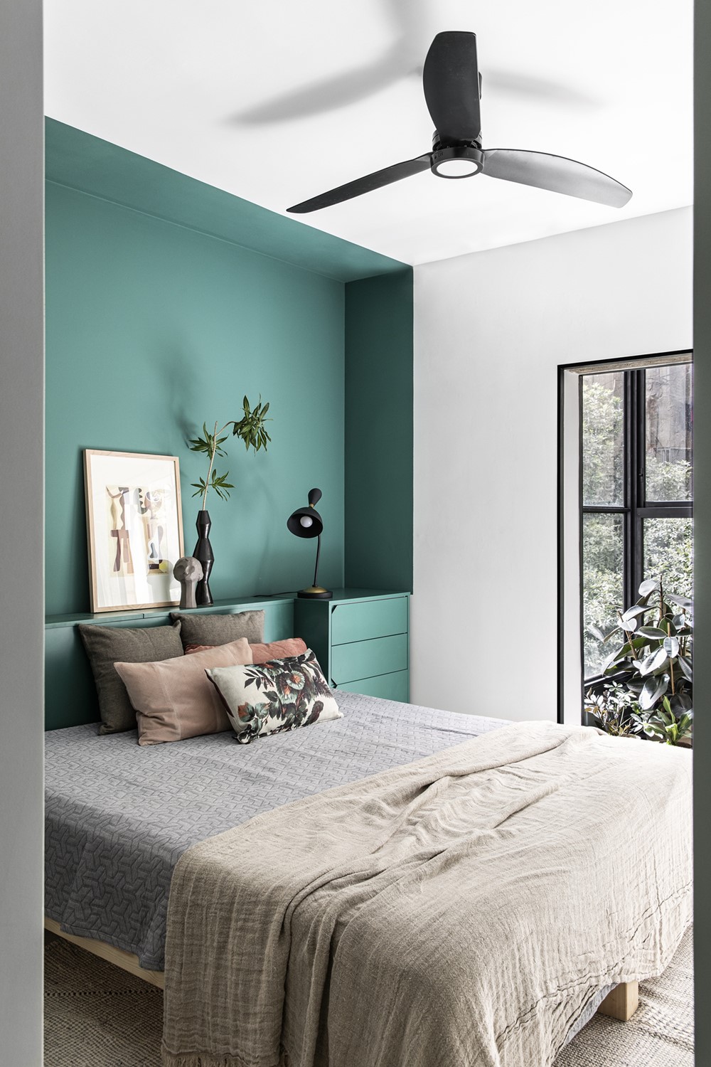
At the end of the corridor lays the master bedroom. Next to the entry there is a constructive column, which we couldn’t relocate, so we have decided to use it to our advantage. We’ve stripped it from the old plaster and exposed the rough looking concrete.
To compliment it and maximize storage space, we designed 2 evergreen-colored storage units surrounding it, from different directions.
We used the same accent color both in the bedside storage units and the framing of the bed, creating a cohesive look.
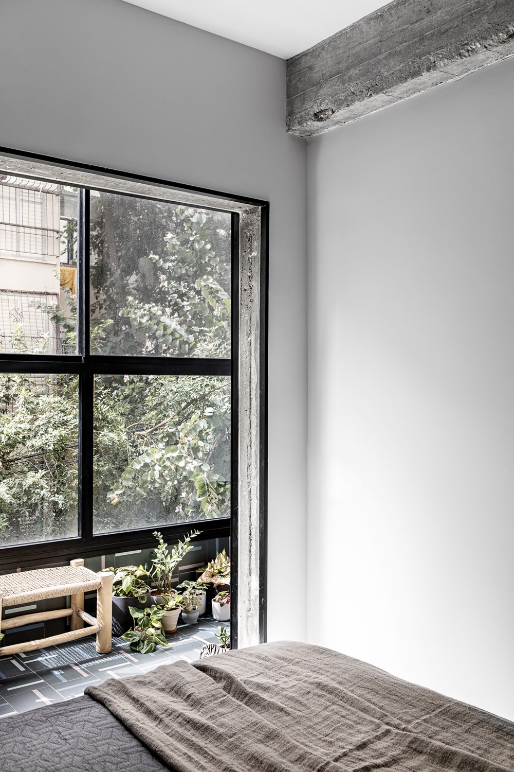
The first thing the couple see when they wake up in the morning is their own private “urban jungle”. A cheeky little balcony, packed with lush vegetation and matching poppy tiles.
The doorframe which is the link between the bedroom and the balcony is another hidden gem – it consists of raw looking exposed concrete with minimalistic black framing profile.
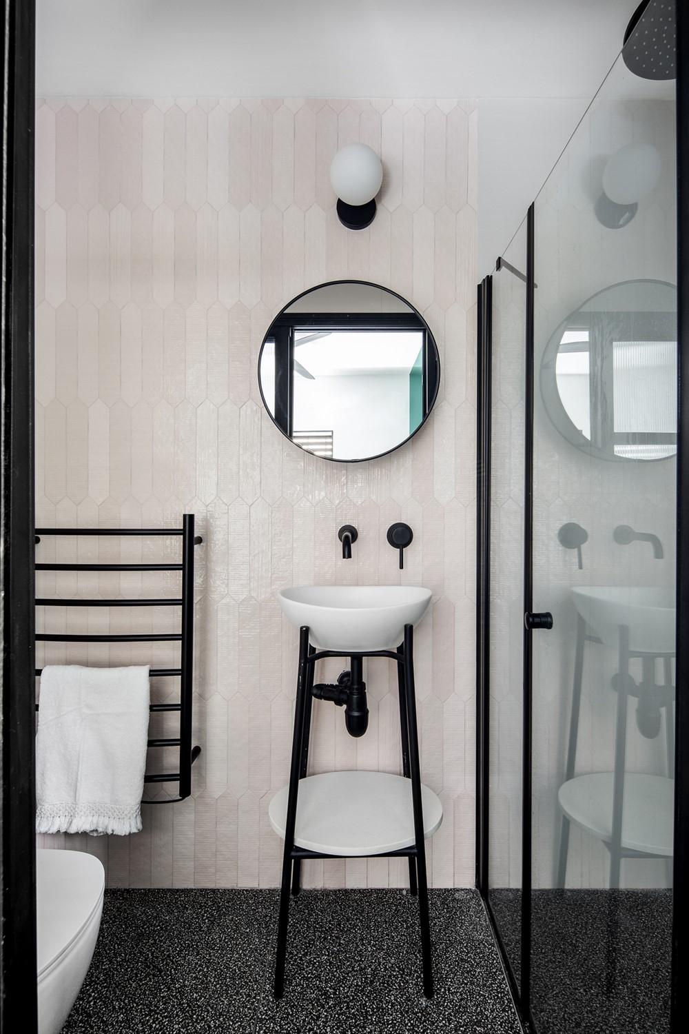
The master bedroom’s ensuite has hexagonal elongated pale pink tiles. The flooring consists of small black and white terrazzo tiles, which echo all the other black and white accents.