The Colander by Unagru Architecture Urbanism was a traditional Victorian terraced house, with a very long and dark entrance hall, very dark kitchen and dining rooms with hardly any direct light. Photography by Sara Moiola.
.
The owners wanted to explore options to make brighten and modernise the house, with a very tight budget. Among the priorities were to design a new kitchen, the option of a side extension and a new access to the loft, which is used for storage. After analysing several combinations, we decided to focus on merging the kitchen and dining areas and extending the property into the side garden. The extension had to be minimal to keep the costs under control. Together with the clients, we also agreed that the main theme of the project would be that of bringing as much light to the centre of the house, which was extremely dark and unwelcoming. We would take advantage of every opportunity to achieve our goal.
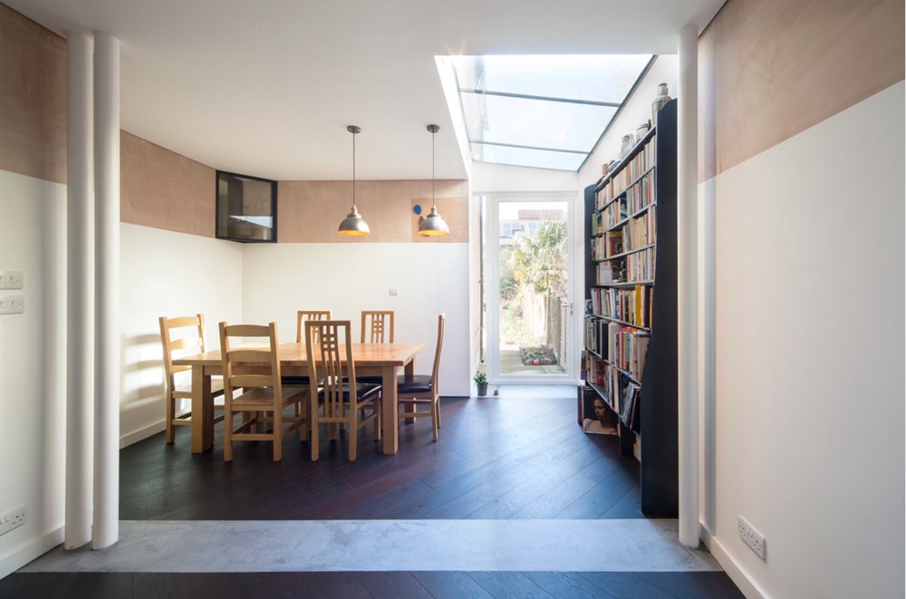
The first step was to solve the layout in a form that would allow minimising extension while maximising the use of the existing space. We proposed flipping around the kitchen-dining layout, with the dining slightly tucked in a curved alcove, and the kitchen in the centre of the home; the kitchen cabinets are placed on the furthest point from the new windows, while the island would be facing the garden and the light.
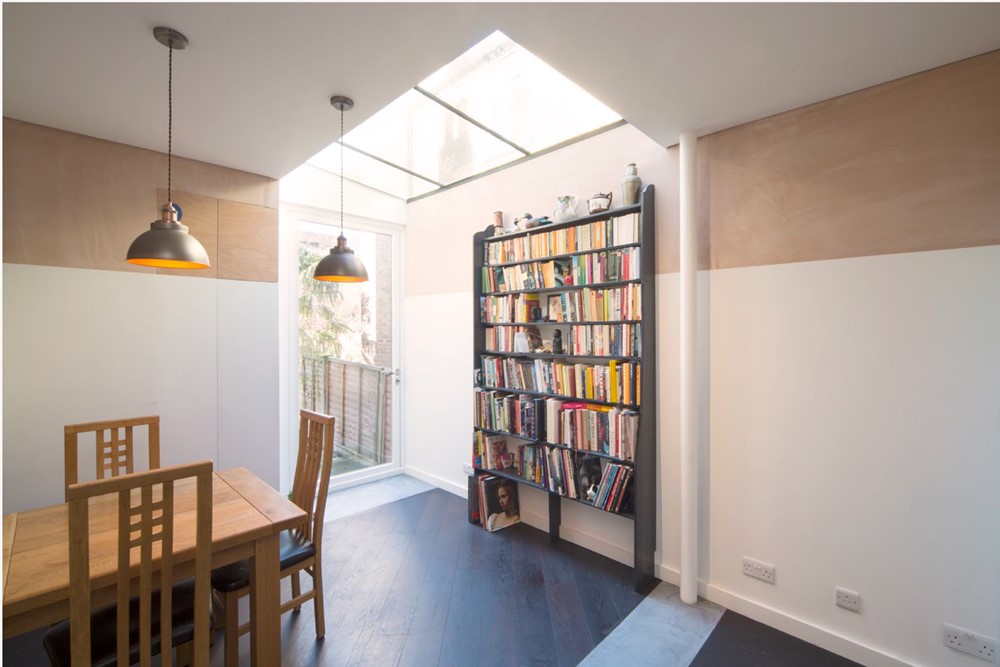
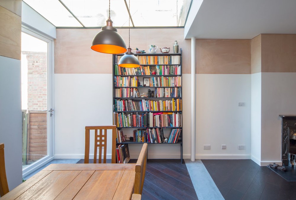
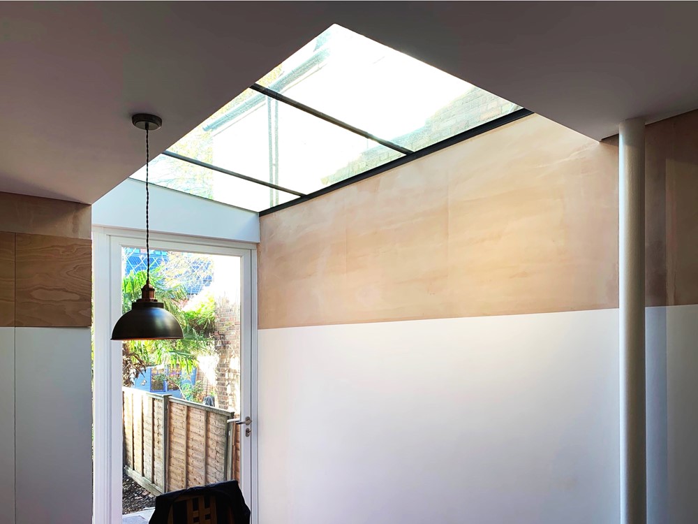
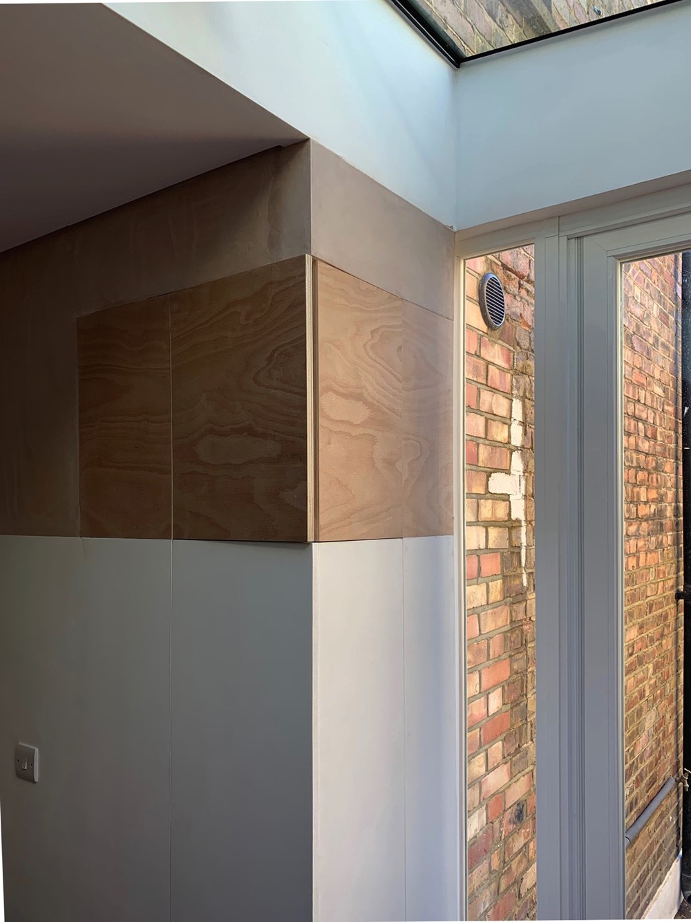
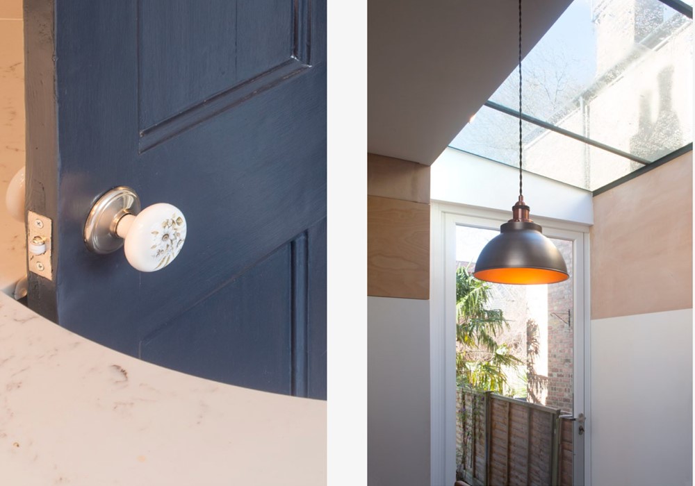
The work on the light started by devising a fully glazed side extension. We then devised interior high level windows, that would bring light and a sense of mistery to the long, dark corridor on the ground floor.
The new staircase to the loft was also an opportunity to bring in light, through a generous roof light that completely transformed the first floor landing.
We worked with the neighbour and the Council to obtain a planning permission which allowed for a higher party wall compared to the typical local restrictions.
The interior finishes and details reflect the history of the building as well as the client’s passion for contemporary contextual architecture. We discussed typical Victorian interiors and modern versions of them. We finally opted for a three-point strategy,
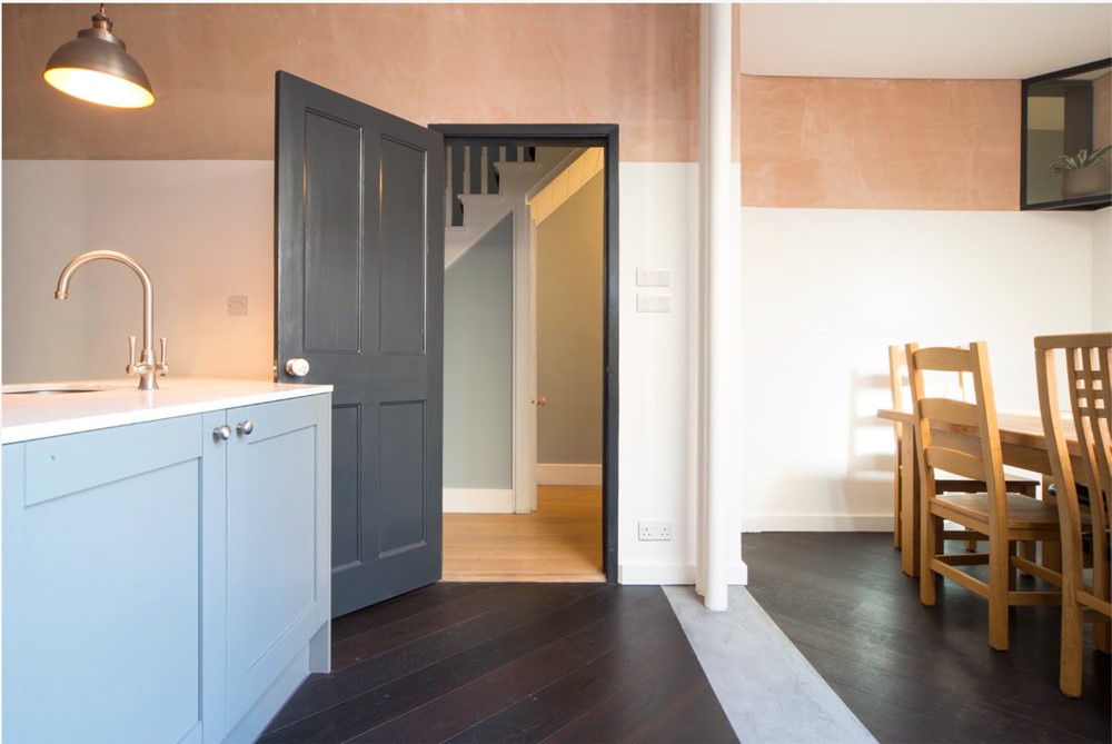
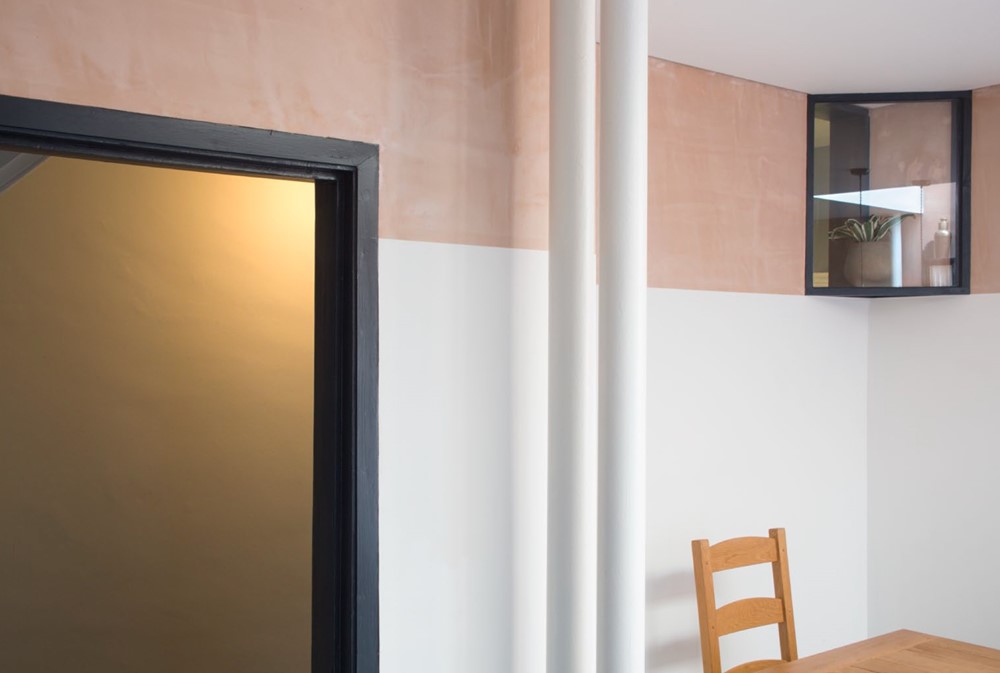
First, we would show all our interventions by exposing the structure and symbolically showing the foundations. The new columns are slim round sections, two on one side one on the other side of the room. The new foundations are shown as concrete strips and pads in the floor.
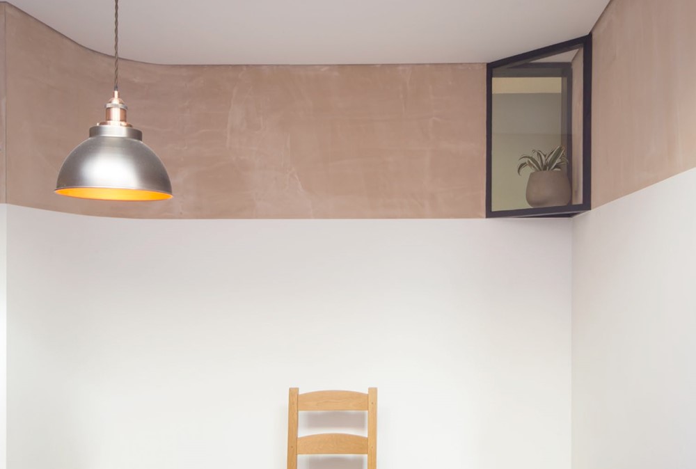
The second strategy was that of “dressing” the room in a very classic ways, albeit with contemporary elements. The high-level windows created the opportunity to define a horizontal line running all around the room. We simply left the plaster exposed above that line, determining a light pink “cornice” detail. The ceiling has, on the contrary a very contemporary shadow gap detail. The floor finish is fitted at45 degrees angles and in two separate carpets. Floor, ceilings, windows and walls are in very contrasting dark and light colours.
Finally, the third strategy was that of incorporating some specific elements of every room (which also allowed us control costs). Where we had imagined a sliding door to the kitchen, we finally decided to keep it and paint it. We then prepared a one to one template of the worktop to create a double curve cutout to swing the door in, in a very classical form.